")

The other day I responded to a random post on Facebook requesting someone to visit an art installation in Farringdon , London, about a typeface!!!!!
I thought this was a great excuse to go to London to see my friend who likes all train related stuff and is full of so much information. I like to learn new things and see new places. So I volunteered.
I know nothing about what I’m going to see so I did a little bit of research. It was very interesting.
The art installation was about Johnston Sans typeface, invented by Edward Johnston (1872-1944)
Commissioned in 1913 by Frank Pick, commercial manager of the Underground Electric Railways company of London to strengthen the company’s corporate identity. Although the typeface was originally designed to be small it was quickly adopted to being the lettering used on the enamel signs of the Underground system.
It has been used as their typeface since 1933 since its induction in 1916. This makes it one of the oldest examples of corporate branding.
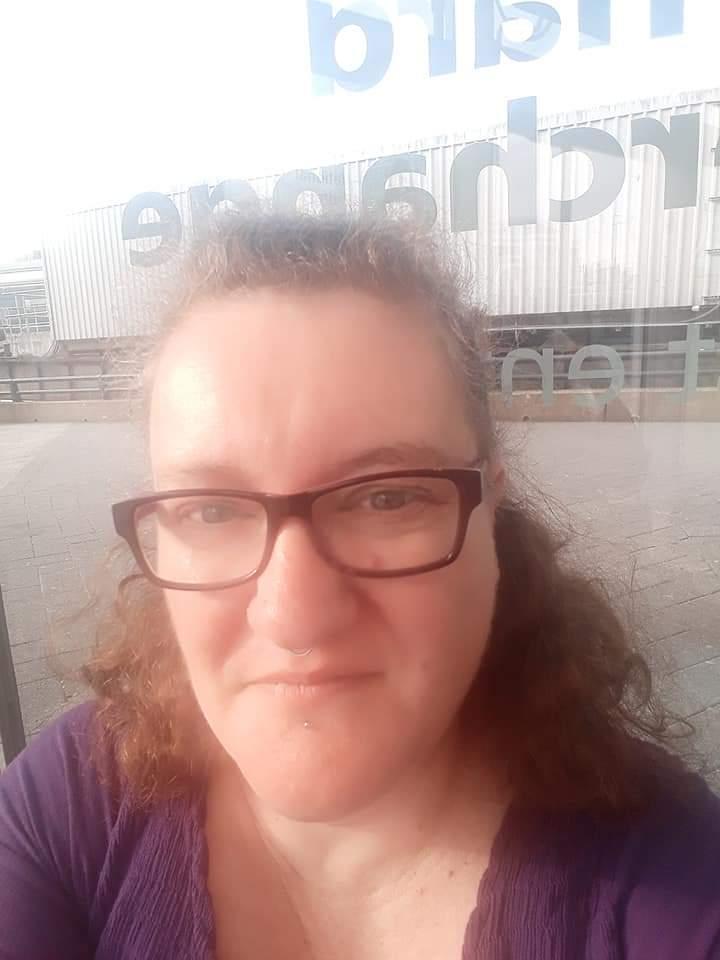
I left Portsmouth Hard Interchange in the morning. It was pointed out to me that the signage behind me in my photo was in fact Johnston Sans. So something I knew nothing about was already in my every day life and always had been.
How amazing at how little thought we take to our surroundings. How we just take things for granted
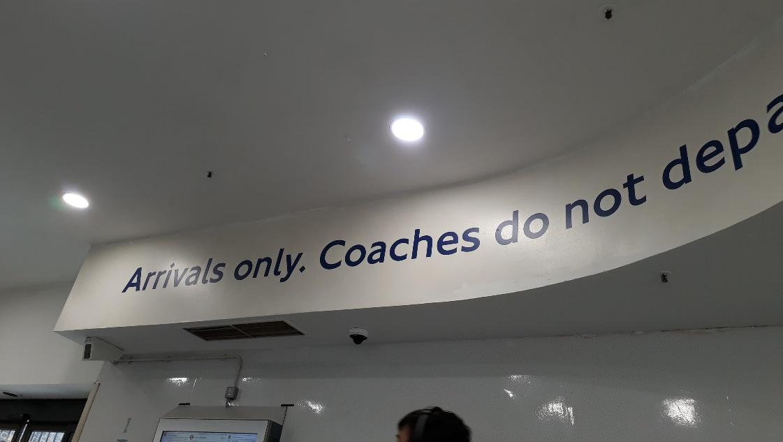
The entrance to arrivals at Victoria Coach Station also used the same writing.
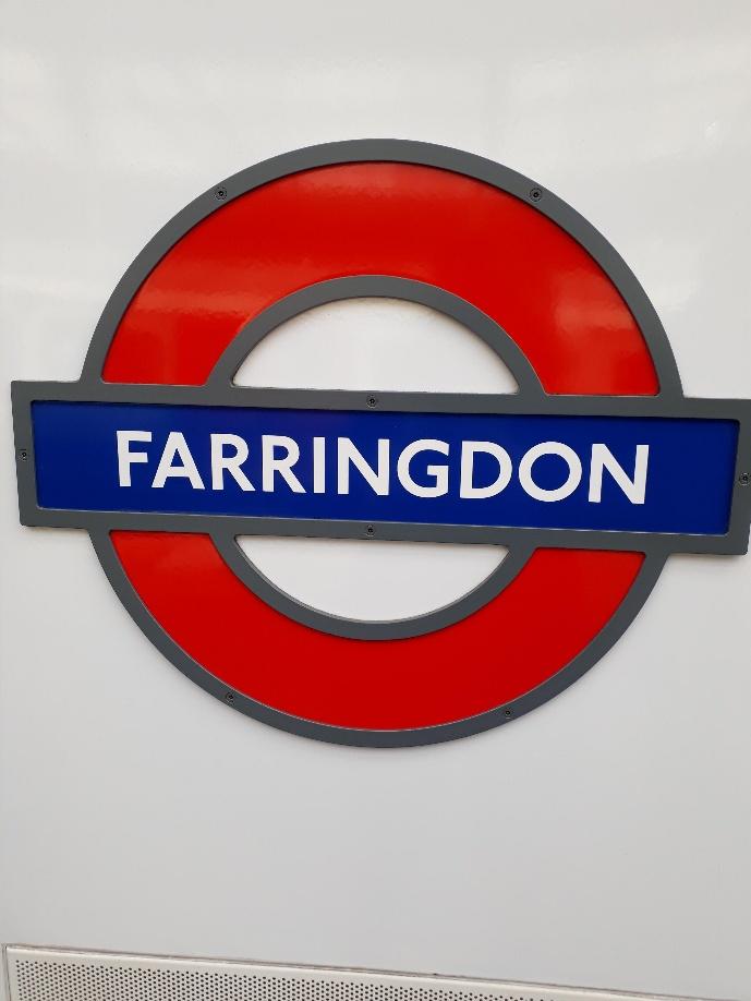
My friend and I got a tube train to Farringdon
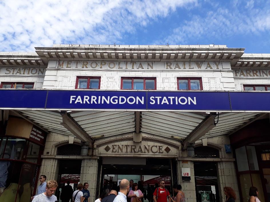
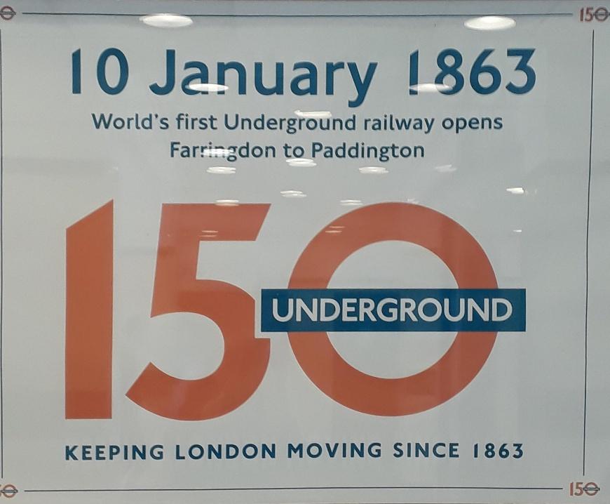
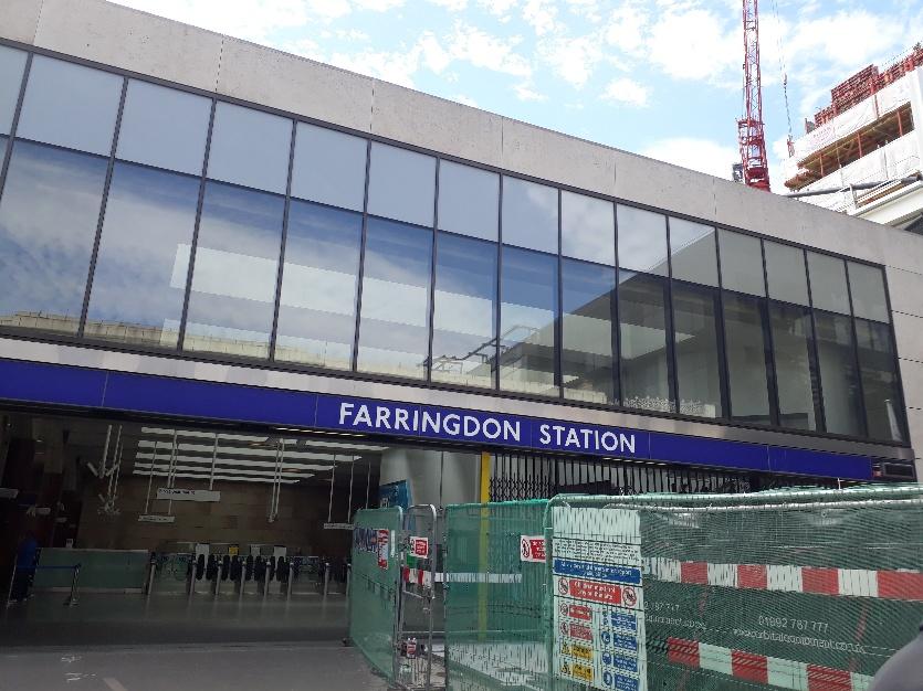
We asked where the display was. The lady was a bit confused and struggled to remember but we were eventually pointed in the right direction. Farringdon Station is an old station opened on 10 January 1863.
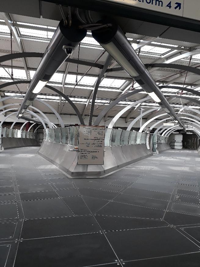
It is a lovely open station. It is at the moment being upgraded and many new features are being added to co-exist with the old, including an amazing bridge with many exits. This will help control foot fall.
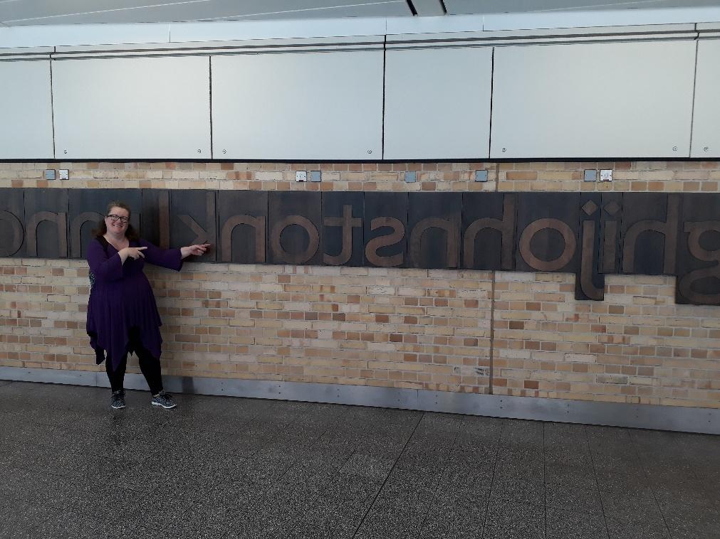
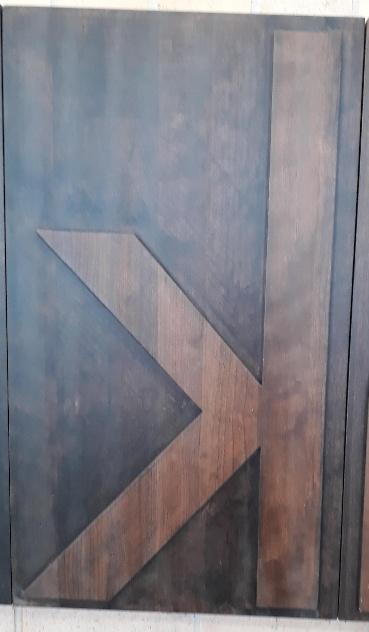
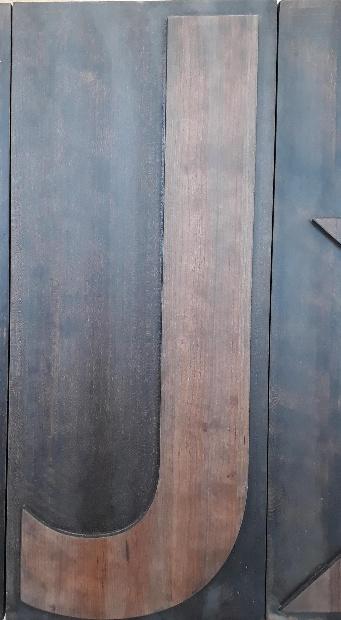
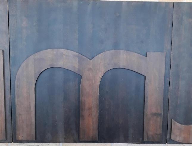
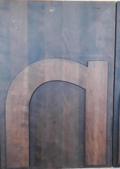
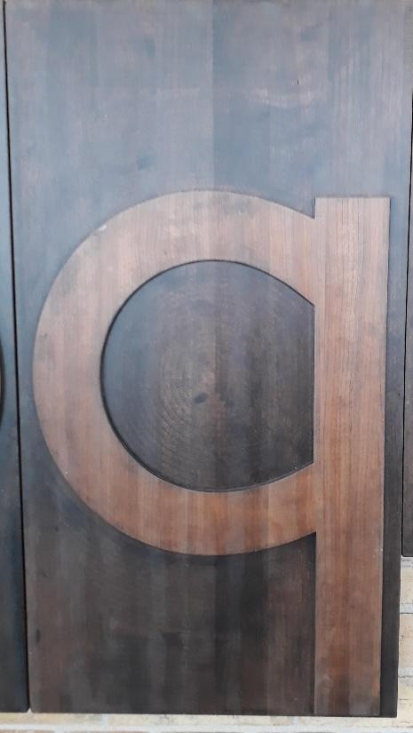
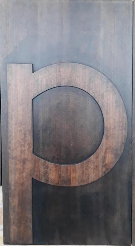
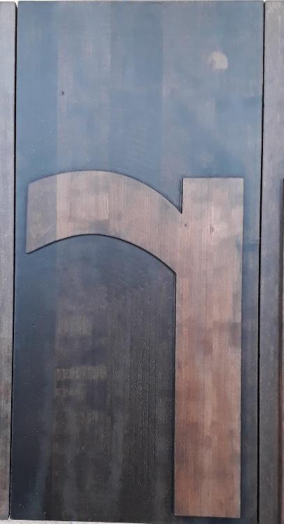
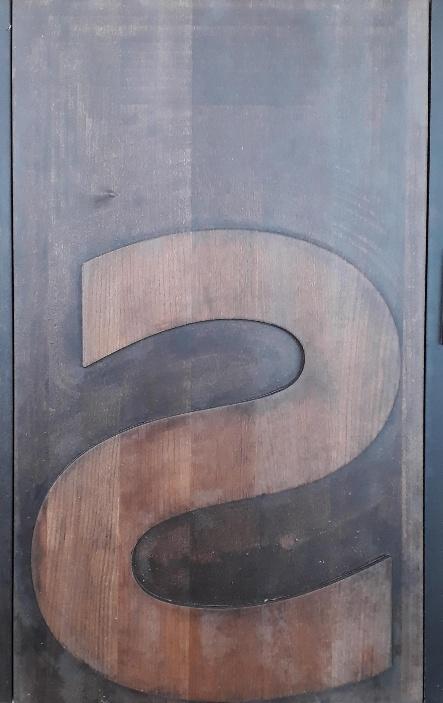
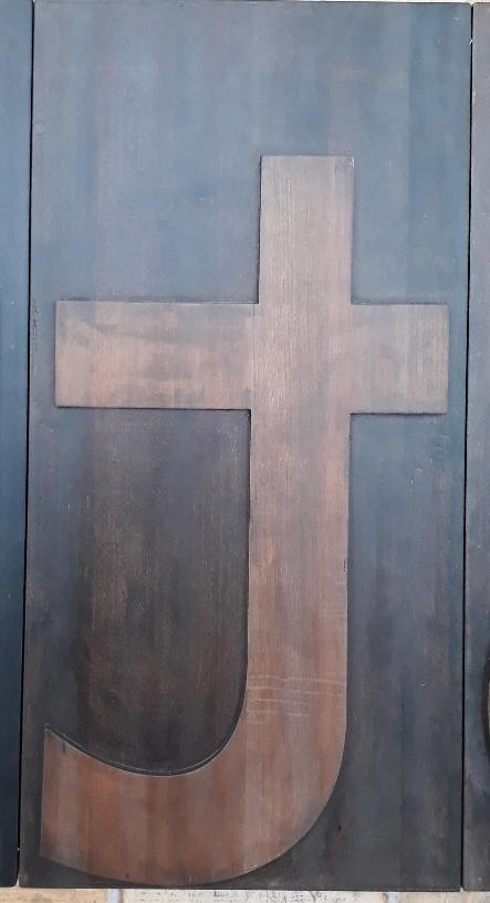
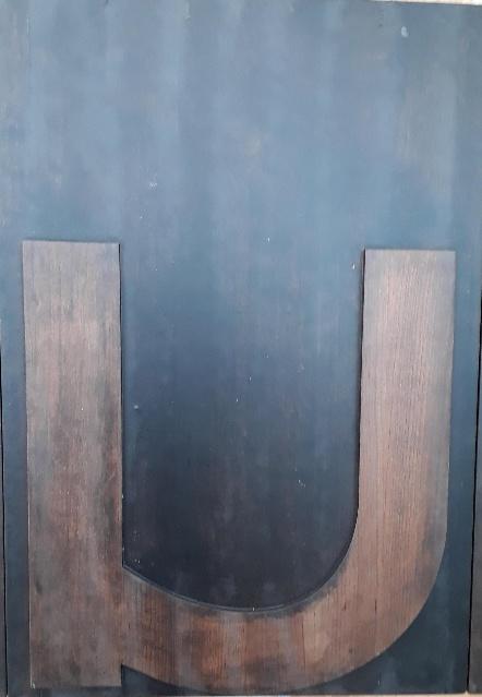
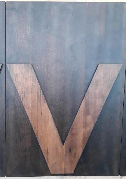
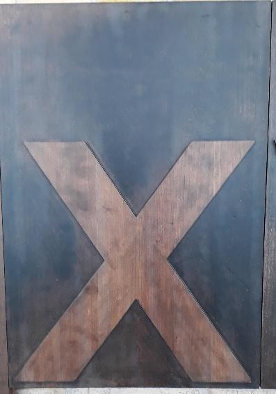
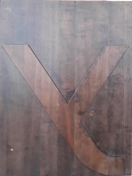
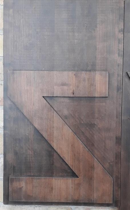
We came across the lovely art installation in a corridor beautifully lit from the windows opposite. It’s made from wood. Rich colours and very smooth. The curves in the typeface flawless. The letters are back to front like it would be for printing purposes.
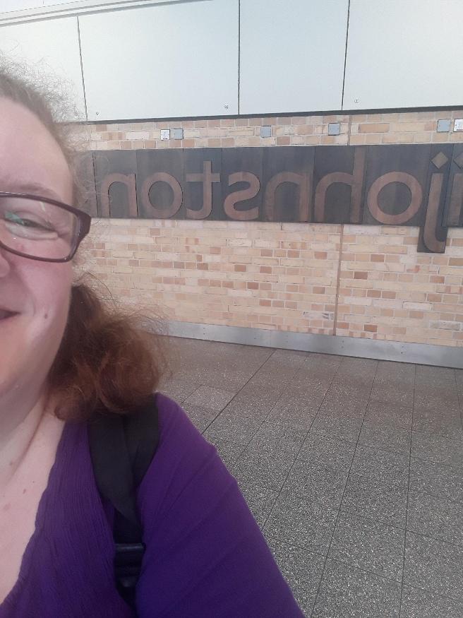
At first glance it just looks like the alphabet but cleverly they have inserted the name Johnston in to the middle. I thought that was really clever.

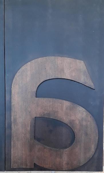
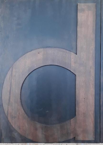
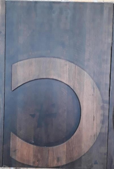
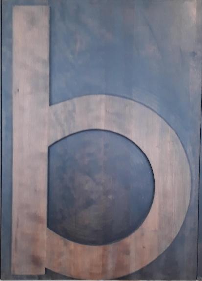
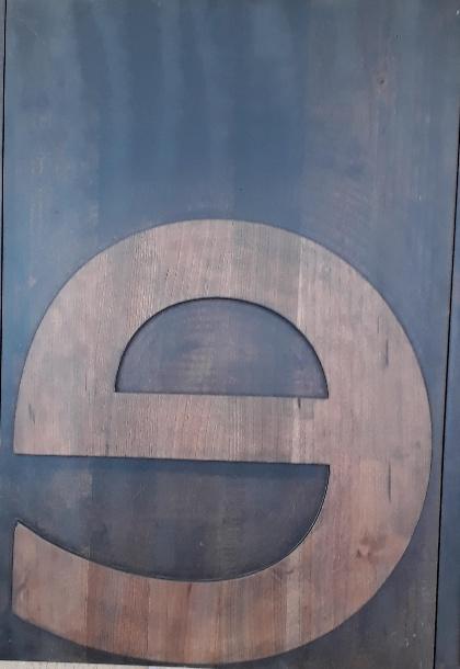
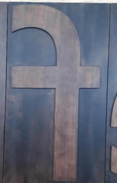
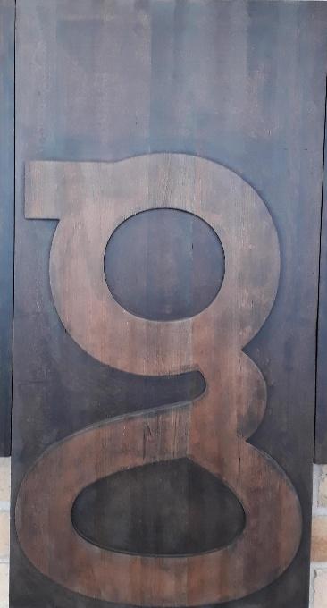
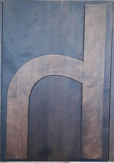
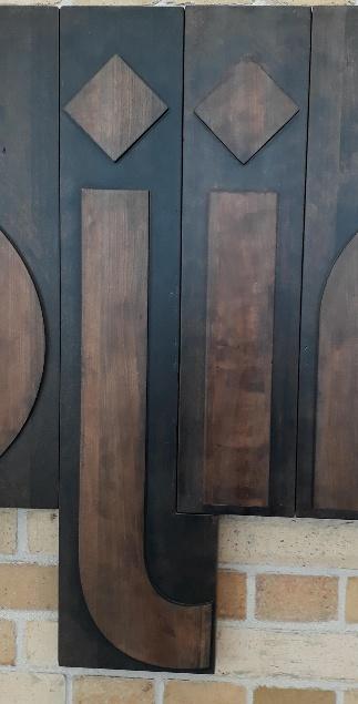
I liked the way the I and j interlocked.
I loved the fact the m was so rounded and wide but the w was very angular.
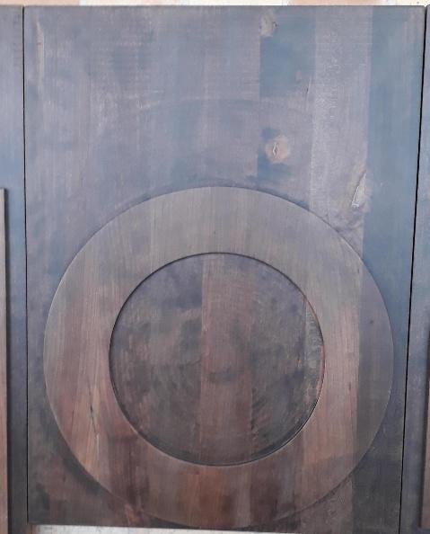

Edward Johnston went on to design the now famous London Underground roundel logo.
It’s amazing to think that a typeface commissioned over 100 years ago has been deemed good enough to continue to be the font used on all logos and posters even in to the digital age.
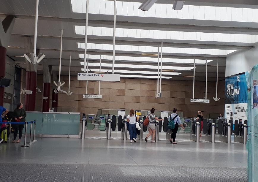
When we left Farringdon Station’s antiquated charm we crossed the road to see a new station being built which will eventually be completely linked to the old one.
This station is new and modern, clean lines, marble floor and walls, but still linked by the same typeface.
The modern era owes everything to what came before.
This was a really interesting day out. One I was very pleased to have done.
If you get a chance, do go and see it.
And yes, I did resist putting ink on the letters and printing on my t shirt!!!!
Thank you for responding to Suzie’s request, this was very interesting.
Thank you. It was great fun to do and I got to meet up with my friend and I learnt stuff. So win win.
It was exactly what I would have done if I’d been there. I’m glad you were able to meet with a friend as well.